
Mapping in Power BI can be super simple. Drop a field with a location in it, add a value, and you’re off to the races.

Mapping in Power BI can also be challenging, and sometimes it takes a bit of trial and error to get a map close to what you want/need. This post is not about mapping options in Power BI – see the resource links below to learn it all! (seriously, visit these links – great content from great people)
In this post I will show you how I created an interactive legend in Power BI that can be used with any of the map visuals. This is absolutely a workaround and adds bulk to the model (so use with caution), but it is what was requested and it works.
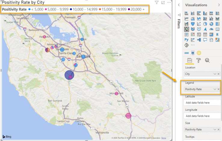
Note that there are legends available in each of the Power BI map visuals, including the out-of-the-box maps, but none of them did quite what was needed here.
Another one of the requests in this use case was that the values in the breaks be manually set and display exactly the same for every date range. You’ll notice in the gif below that the breaks are dynamic – which is not what we were looking for. We wanted each time period to be compared to the other using the same breaks or categories.

One workaround I have seen in the past is to add a static image, but that also wouldn’t work here, as we wanted something interactive (for cross-filtering). Here’s how I did it and what I ended up with!
1) Ensure you have your breaks or categories set.
There are a number of different ways to do this, but in this case we used a couple of additional columns in Power Query. **Caution: Adding columns adds bulk to the model and is not a best practice if you plan to scale your reports. In this case, the data was not modeled in a star schema* and I added columns to accomplish the goal.

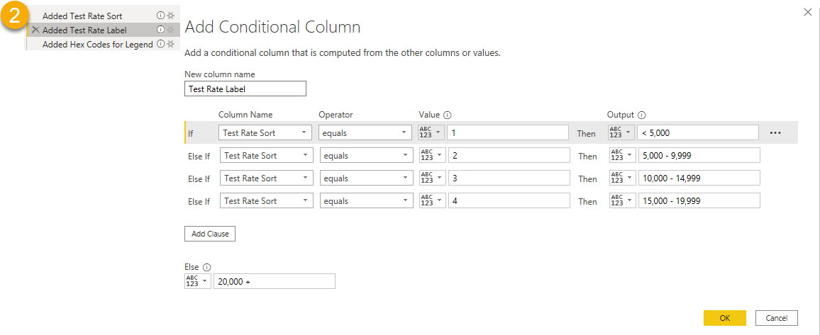
2) After you have your categories set, you’ll want to add the text that you want to appear in the legend. Add a conditional column and add the text you want to appear in the output.
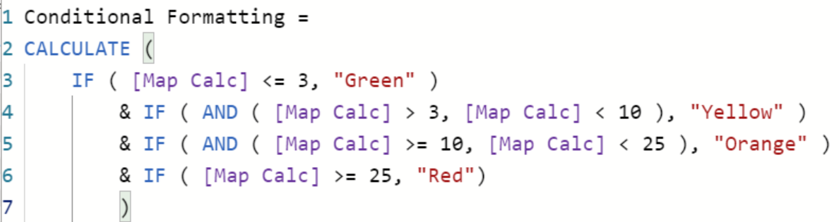
3) This is the fun part – now you can set the hex codes for the colors that you want to appear in the legend!
My two favorite websites for looking up and figuring out hex code colors are Color Picker Online (where you upload an image) and HTML Color Codes (where you can pick from a palette).

Here’s an example of how you can accomplish something similar with a measure (if the data is structured differently). You can use either a color name or a hex code. I think the color thing is pretty slick! How did they do that?!
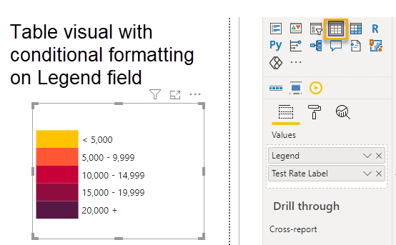
4) Now you can drop the values into either a table or matrix visual to create your legend!
5) We will apply conditional formatting based on a field value to get the hex colors to appear.

Apply conditional formatting to both the background AND the font color of your column of interest. In this case it’s the Legend column.
This is also a nice trick to use if you want to build a scorecard! You can do much more with table and matrix visuals than you might initially think – there’s a lot of room to get creative!
6) You’ll then change the font color of the column headers (as there’s no one-click way to make them disappear).
7) You will also need to sort the Label field by the Sort column that we created in Step 1 (Test Rate Sort). To sort one column by another, select the column of interest in the field pane
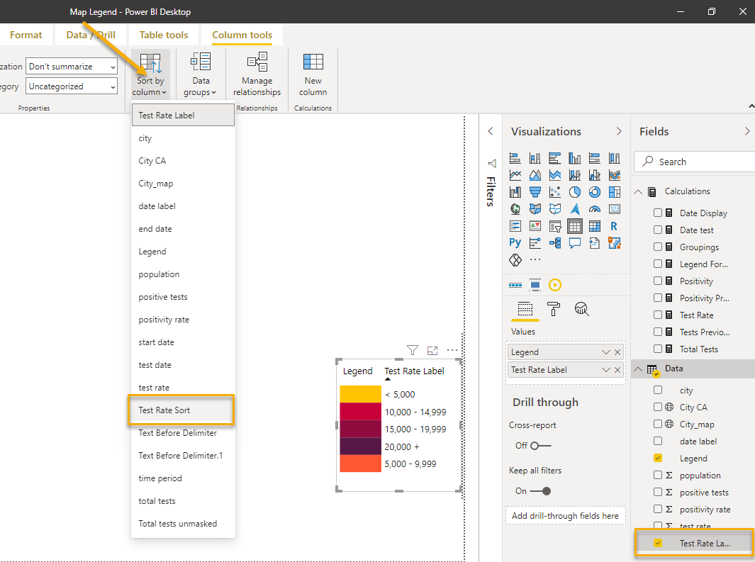
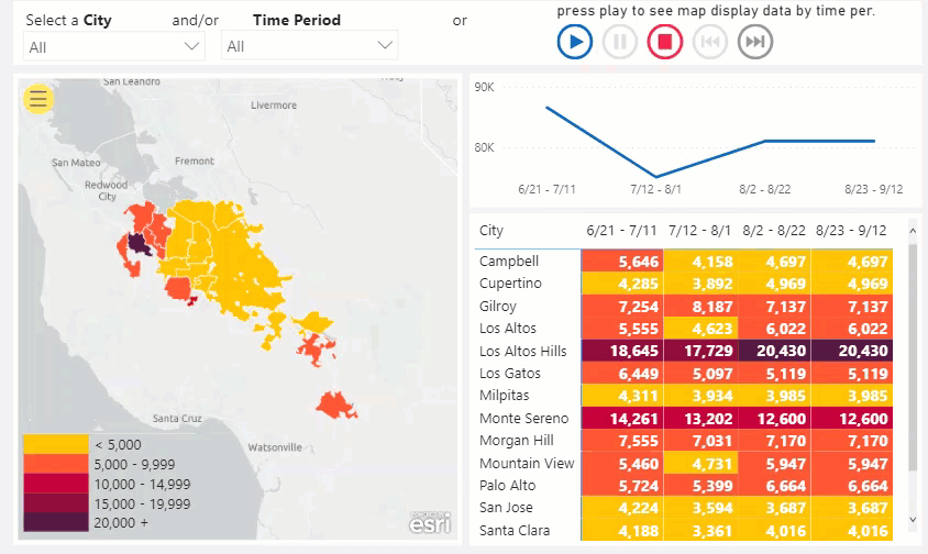
After things are sorted correctly you’ll have your final result that you can place on your canvas, which will interact with all the other report visuals.
8) The final step is to edit the interactions between the legend and the other visuals on the page. As you click on other visuals, you still want the legend to display without cross-filtering, so be sure to adjust that using Edit Interactions on the Formatting tab of the ribbon.

Now you’ll see that this legend serves its purpose. It tells readers what they’re looking at and is also interactive. Voila!
If you’re still reading it’s either because this is something you really need or you’re just curious about this workaround. Thank you for sticking with me! This solution is not elegant, but it’s something I have seen folks struggle with when using maps in Power BI and I hope that it helps!
Follow this link to download the sample Power BI Desktop file.
Note that to use this solution, data must be summarized at some level. In the example above, the data came into Power BI in that format. If you’d like to see another example where the data is more granular and has been summarized in Power Query, check out this video from a recent Power BI User Group meeting.
If you’re interested in learning more about mapping in Power BI, here are some resources you may find helpful:
- Microsoft: Tips and Tricks for Power BI Map Visualizations
- Esri: ArcGIS Maps for Power BI
- James Dales: Icon Map
- Alice Drummond: Create 3D Maps in Power BI with MapBox
- David Eldersveld: 10 Ways to Create Maps in Power BI
- Warren Dean’s Webinar: Which way to the right map in Power BI?
- Reid Havens: Introducing the Azure Maps Visual in Power BI
- Mitchell Pearson: How to Add Labels to Maps in Power BI
Have a favorite resource for mapping in Power BI? Is there something I missed in this post that the Power BI world needs to know? Please drop them in the comments below!
Double, double toil and trouble;
Fire burn and caldron bubble.
*disclaimer: not my model

Great info, thanks. Is it possible to get a sample .pbix file so I can see how it all works first hand.
LikeLike
Hi Steve – absolutely! Give me a couple of days and I’ll happily drop a .pbix file here in the post. Great suggestion!
LikeLiked by 1 person
Here’s another resource from a Michigan blogger, David Eldersveld, 10 Ways to Create Maps in Microsoft Power BI, https://dataveld.com/2017/06/03/10-ways-to-create-maps-in-microsoft-power-bi/
LikeLiked by 1 person
Thanks for sharing George! I will add this to the list in the post. I appreciate it!
LikeLike
[…] and will have the benefit to work as a common legend for an entire report page, as explained in this post and demonstrated in the video below. This involves creating an additional data table where you […]
LikeLiked by 1 person
Thank’s a lot! This example helped me with a map that needed a legend like this.
Good job!!
LikeLike
Sorry I’m probably totally missing something – but how do you apply your selection of colours chosen for the legend to the areas on the map as well? From what I can see Power BI just allows you to select a colour for each the maximum and minimum values to be mapped and shades the areas on the map accordingly…
LikeLike