The general idea
When using slicers in Power BI reports, multiple selections filter data with OR logic. For example, if you have a slicer with products and your visuals are displaying total number of invoices, then when “bicycles” and “helmets” are selected in the products slicer your visual will show the number of invoices that include bicycles OR helmets. But what if you need to have it instead only show the number of invoices that include bicycles AND helmets? Read on to find out how you can do just that with DAX.
My specific problem
You don’t need to read this section very thoroughly to find out how to solve the problem, but it might be useful or interesting to see a specific scenario.
I work with data that tracks the number of people in Sub-Saharan Africa being treated for HIV in health facilities in about 10 countries. The granularity of the data is at the health facility level and a time period, such as a month or a quarter. For example, it tracks things like “number of people tested for HIV”, “number tested positive”, “number of newly positive people started on treatment”, “current number of people on treatment”, etc (people with HIV can live long and healthy lives as long as they start treatment early and remain on treatment for their whole lives). We like to look at these numbers over time so we can ensure that we are continuously testing people, getting HIV-positive people onto treatment quickly, and avoiding having people stop treatment. Seeing that the number of people tested or currently on treatment significantly goes up or down from one month to the next would be a big red flag.
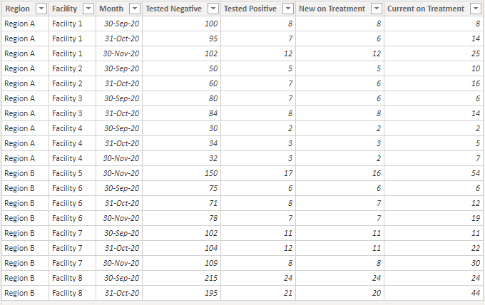
I’ll simplify the data here for illustration. Imagine that we have data for eight health facilities in two different regions of one country for three months. It might look like this:

So if we visualize the data in a simple bar chart below (with the sweet new small multiples!), it appears that our total number of people tested for HIV in each region is trending down each month. This might start to worry us about why we are testing fewer people and would lead to time spent trying to understand what is causing this downward trend. Could it be a shortage of testing kits or could people be having trouble accessing facilities for some reason?

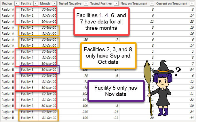
However, if we look more closely at the data, we can see that we didn’t have data for some of those facilities for all three months.

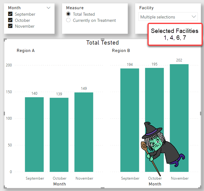
This might be because those facilities were supported by another organization before, and we just started supporting them mid-year. Or perhaps it’s the other way and we supported them but then mid-year they moved to another organization. In these scenarios, we shouldn’t really be including them in our totals for the region if we’re interested in seeing a trend. We should only be including facilities that we have data for for all selected months. One way to do that would be to add a slicer for facility and push the problem on to our end users by forcing them to specify which facilities to include.

Phew – this data looks a lot more like what we would expect to see! Pretty consistent numbers of people tested, because we’re only including facilities with data for all three months. But we don’t want to force our users to have to figure out which facilities to include! There could be thousands of facilities, and that would just be miserable. We want to give our users the option of only including facilities that have data for all of the months they’re interested in looking at, without having to know which facilities they are.
And this is where we finally get to the solution! At first I thought that perhaps I could add a calculated column to a facilities table to tell me how many months of data we had, based on the slicer selection, and then filter on that. Until I remembered that slicers and filters don’t affect calculated columns – curses! This is because calculated columns are computed during the model refresh, and not on the fly in the report (more helpful info here: https://www.sqlbi.com/articles/calculated-columns-and-measures-in-dax/). So, we have to do it in a measure. I needed some help on this, and fortunately Patrick LeBlanc and Phil Seamark were willing to assist, so the following solution is fully credited to them. Thanks, Patrick and Phil!
The solution
First, because I can’t use calculated columns to solve this problem but I still want to be able to apply the logic to multiple measures, I created a couple of measures for [Currently on Treatment] and [Total Tested] and then also created a disconnected measures table to allow the user to select which measure to display in a slicer. Then I created a measure called [Selected Measure Value]. However, this method could get ugly if you have a lot of measures, in which case you might want to consider using calculation groups instead.
Selected Measure Value =
    SWITCH(SELECTEDVALUE('Measures for Slicer'[Measure])
        , "Currently on Treatment", [Currently on Treatment]
        , "Total Tested", [Total Tested]
        , BLANK()
        )
With that out of the way, it’s time to create another measure that calculates the Selected Measure Value, but only for facilities that have data for the selected measure for *all* of the selected months, not just *any* of the selected months. This is that bit about *and* vs *or*. (When I was first trying to figure this out, I had a little trouble even recognizing that this was the problem I was trying to solve. Sometimes it’s hard to figure out the right way to ask a question.)
Selected Measure Value (only for facilities with data for all selected months) =
    // Get the number of months the user selected
    VAR SelectedMonthsCount = CALCULATE(COUNTROWS(VALUES(Dates[Month]))
                                        , ALLSELECTED(Dates))
    VAR output = SUMX (
        VALUES( Testing[Facility] ),    //Get each facility in the current context
        VAR x = ADDCOLUMNS (            //For each facility, set a flag for whether
                                        //there is data for each selected month
                    ALLSELECTED ( Dates ),
                    "Flag", IF ( NOT ISBLANK ( [Selected Measure Value] ), 1, 0 )
                    )
        //Count up the number of months with data for each facility
        VAR MonthsWithDataForFacility = SUMX ( x, [Flag] )

        //If the number of months for the facility matches the number of
        //selected months, include that facility, otherwise exclude it.
        RETURN
            IF ( MonthsWithDataForFacility = SelectedMonthsCount, [Selected Measure Value] )
        )
    RETURN output
The trick here boils down to using an iterator (or “X”) function. Basically what we’re doing is getting the list of facilities in the current filter context, and for each of those facilities we’re checking to see if the number of months with data (of the months selected in the slicer) is the same as the number of months selected in the slicer. If so, we include that facility, and if not we ignore it. Lines 3 and 4 find the number of months selected in the slicer. Line 5 begins the iteration, and line 6 gets our facilities to be iterated through. Lines 9 and 10 check to see if the facility has data for each of the selected months, and line 13 counts up the number of months with data. Line 18 is where we decide whether to include the site based on the number of months with data.
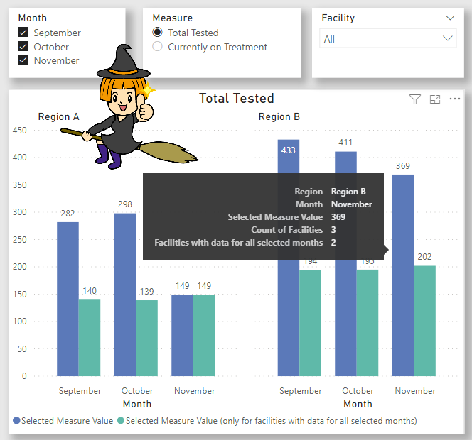
Using both of these measures on a chart makes it easy to see the difference of using the or behavior compared to using the and behavior. In the image below we can see on the tool-tip that although 3 facilities in Region B had data in November, only 2 of those facilities also had data in September and October. And while we see a sharp drop in Region A going from October to November using the simple measure (blue bar), we actually see an increase if we only include facilities with data for all three months (green bar).

By including the measure for the green bar in the chart above, we can save staff from having to waste time figuring out that the reason for the sharp change in people being tested is only because of a change in which facilities have data and has nothing to do with real problems such as a shortage of testing kits.
Interested in taking a look at my solution? You can find the Power BI Desktop file here!
Can you think of any other scenarios where this might be used? If so, please let me know in the comments.
Other useful resources
- Create a Disconnected Measures Table (Gilbert Quevauvilliers): https://www.fourmoo.com/2017/11/21/power-bi-using-a-slicer-to-show-different-measures/
- Apply AND Logic to Multiple Selections in DAX Slicer (Marco Russo): https://www.sqlbi.com/articles/apply-and-logic-to-multiple-selection-in-dax-slicer/
- Slicer with AND Condition in Power BI (Reza Rad):
https://radacad.com/slicer-with-and-condition-in-power-bi
Double, double toil and trouble;
Fire burn and caldron bubble.


[…] Stephanie Bruno embraces the healing power of AND: […]
LikeLike
We need this in our project
LikeLike