

As much as we try to convince our colleagues to do more of their work in Power BI and less and less in Excel and PowerPoint, we all know they’re going to smile and nod at us then go back to their desks and click “Export data” on our carefully developed Power BI visuals, open that file in Excel, and make their charts and tables in the tools they’re comfortable with. We may have some success in getting people to use our reports the way that nature intended, but we also have to accept that no matter what we do, Excel, Word, and PowerPoint are still very much part of the picture.
Once we accept this, we can try to work together to help our friends so they don’t have to live through the never ending loop of export copy paste copy paste copy paste copy paste…..
In my case, colleagues are required to develop reports every quarter with the most updated data we have and with a lot of commentary included. For example, they create the same 60-page document every quarter with the same tables and charts, and then modify the narrative depending on the data. For this reason, paginated reports may not be the right solution because the narrative varies so much. They also have a very particular format for the charts and tables that is hard to reproduce in Power BI. Finally, the data may be changing up to the day before the report is due. Their process in the past was to export the data they needed from Power BI, open it in Excel, copy and paste to another file where they had all of their charts built, export/copy/paste from more visuals, tweak the charts, then copy and paste the charts into their Word document. Then work late into the night doing this a few more times as the data is updated.
To help free them from this tedium, we worked out a new process to get their Word and PowerPoint files automatically updated in the format they required, using our good friend, “Analyze in Excel.”
First, make sure you have a nice, clean, well-organized data model that won’t scare off your users. Then, teach them about Analyze in Excel. There are multiple ways to start, but one easy method is to open up a report using the model you created, and choose “Analyze in Excel” from the Export menu.

This will open a dialog box where you can save the Excel file. This file is now connected to the data model, so whenever the Excel file is opened, it gets any updates to the data or the structure of the model. With this, it’s really easy to create pivot tables and pivot charts that stay connected to the data. This is a huge advantage over exporting the data and then opening it in Excel, because that exported data is disconnected from the model and can quickly get stale.
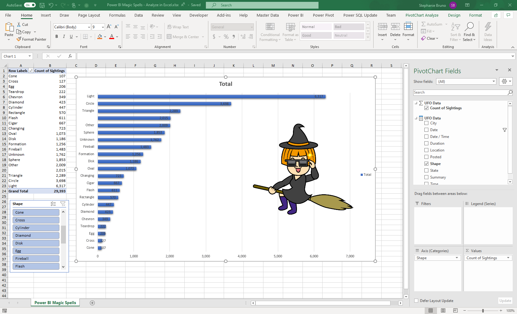
Here’s a quick pivot chart using Analyze in Excel. Let’s pretend I actually spent time tweaking it and making it look really good for my important presentation or report in Word.
With that work of art ready to go for my report, it’s time to put it in the PowerPoint or Word doc, but the important part is to keep them linked together, so that in the future when the data changes, all I need to do is open the Excel file (to get the latest data) and save it so that when I open the PowerPoint or Word doc it will display the latest data. If I just copy and paste, it will paste a disconnected image instead of a link. Instead, we do a paste special and paste it as a link to an Excel object.
First, let’s do it in PowerPoint. The first step is to copy the chart in Excel just like you would for anything else. Ctrl+C will do just fine. Then in PowerPoint, click the Home tab, the down arrow on the Paste button, and finally “Paste Special.”
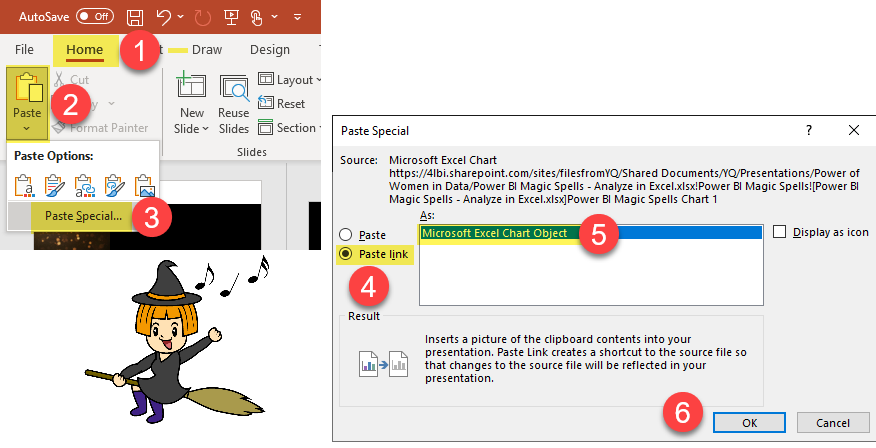
In the dialog box that opens, click the “Paste link” radio button. This will filter out the “As:” window to just Microsoft Excel Chart Object. The “Paste link” bit is the important part. Then, just click the OK button. It looks just the same as if we did a normal paste.

But now when the chart changes (like when it gets refreshed data from the Power BI model or if we decide to filter some data out with a slicer or filter in Excel), the chart in PowerPoint gets updated, too!

In Word, there are even more options. It’s easy to copy and paste a link to a range of cells, a chart, or even just the contents of a single cell. This can come in handy if you want to dynamically update some text in a paragraph. Used in combination with CUBE formulas in Excel, it’s pretty powerful. I’m not going to get into the details of CUBE formulas here, but they allow you to access a data model and write formulas in Excel to use the data, rather than being limited to just pivot tables and pivot charts.
In Word, your choices for paste special are similar to PowerPoint, but if you want to embed the values of a specific cell in Excel into some text, the choice is just a little different. Instead of linking to a Microsoft Excel Chart Object, you just link to Unformatted Unicode Text after copying the cell in Excel.

Is this solution simple? No. But is it elegant? Also no. However, it does work and with some practice with Analyze in Excel it’s a decent workaround to help break the export-copy-paste cycle of doom.
If you’re looking for a more simple and elegant solution, you can consider paying for DevScope’s PowerBI Tiles Pro tool.
Double, double toil and trouble;
Fire burn and caldron bubble.

Great blog post!
LikeLike
[…] Stephanie Bruno solves an interesting problem: […]
LikeLike
This is amazing. I am guilty of doing the export data thing. I will try the connected power point the next time
LikeLike
I wish the witches would come back. I have used all of your posts in one way or another.
LikeLike
Aw, thanks _ATN! We want to come back, we’re just still balancing covid and kids school and new jobs. Consider this a pause and not an end! Thanks for the kind words!
LikeLike