
This week I got to be a guest contributor for the Workout Wednesday challenges for Power BI and used the opportunity to create a radar chart with SVG and display it in a matrix to simulate small multiples. You can download the solution file here.
The Power BI core visuals are great and continually getting better. Top it off with custom visuals or go next level with Deneb and you can do almost anything! Another option I really like to add to the mix is SVG images, especially because you can put them into a table or matrix to create a pseudo-small multiples situation. In this post I’ll show how to create a radar (or spider) chart with SVGs, which can then be dropped into a table or matrix to mimic small multiples.
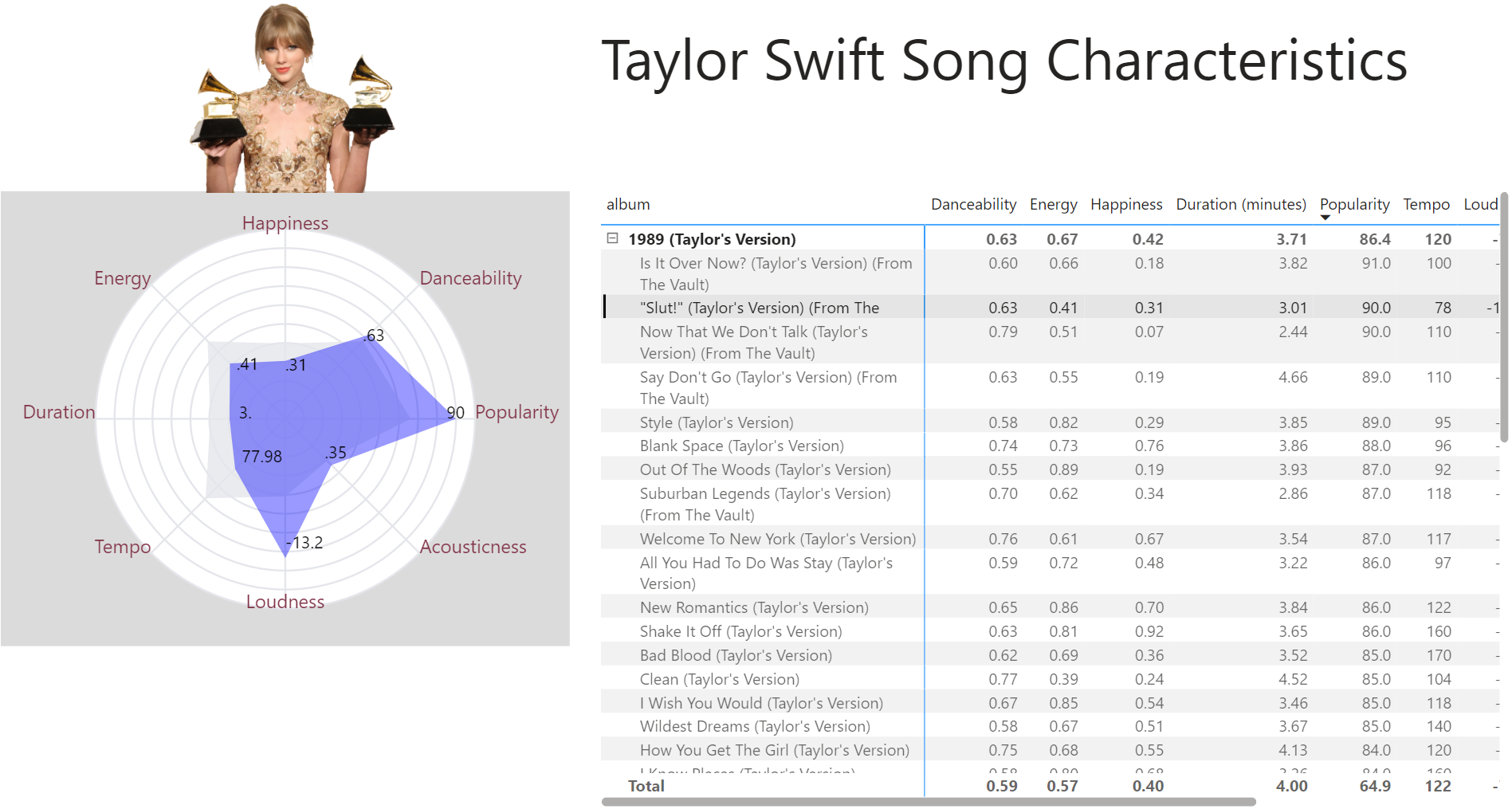
Radar (or spider) charts are a way to look at multiple metrics, perhaps with a different range of values for each metric, on a single chart. In this example, we’ll look at characteristics of Taylor Swift songs from a Spotify dataset (I have a daughter who still hasn’t forgiven me for not getting tickets to the Eras tour, so hopefully this will make up for it). A matrix with the radar SVG allows us to quickly compare these song characteristics (you can get the dataset and the descriptions of the characteristics here). There are existing radar/spider custom visual charts that are great, but none of them currently have a small multiple option, so we can’t use them to create the visual below, for example.
This post is more about how to create SVG charts rather than about the benefits of radar charts in particular. In fact, radar charts have drawbacks such as challenges reading the circular layout, different scales causing confusion, and the shape being dependent on the ordering of the metrics. However, some people really like them and they can be useful for easily spotting differences. And they’re fun to build with math so as an added bonus we’ll take a trip back to high school geometry (I also have a son whom I am trying to convince that geometry is pretty sick).

Deneb Alternative
One method to do this is with Deneb, and Davide Bacci has a great sample that you can find here if you’d like to explore that route as an alternative. An image of the output from his Deneb solution is below.

Radar with SVG
If you’re not familiar with SVG images in Power BI, a good place is to start with David Eldersveld’s overview (https://dataveld.com/2018/01/13/use-svg-images-in-power-bi-part-1/) and Meagan Longoria’s excellent post on clickable SVG images (https://datasavvy.me/2022/12/15/clickable-svg-images-in-power-bi-using-the-html-content-custom-visual/).
The basic idea is that we’re going to draw out the image we want with a series of lines, dots, and shapes on a coordinate plane. If you look at a radar chart, it’s just a series of concentric circles for the background, reference lines from the center of the circle for each measure, dots on the lines for the values, and a polygon that connects the dots.
One really helpful tool to start playing with SVGs is the SVG Viewer website. You can choose a shape and see and edit the code for it. I’ve saved the code for an SVG here: https://www.svgviewer.dev/s/Ud6btqcP. You can go there and choose different images, or edit this one to get it to your liking and practice a little with the code. Play with changing coordinates, colors, stroke width, etc.

Let’s look at each one of the components of a radar.
- Circles:
We just need the x and y coordinates for the center of the circle and the radius. These are the simplest piece to figure out. Keep in mind that for an SVG (0, 0) is the top left point of the window, not the center. So if the height and width of the box are both 400, then the center point is at (200, 200). - Reference lines:
For a line we need the (x, y) coordinates of the start and end points of the line. One of them is the center of the circle, but the other end will have to be figured out based on the radius of the circle and the angle of the line. We’ll get back to that in a bit. - Points for the metrics:
Points are just a simple (x, y) location, but finding the coordinates is also where the math comes in. It’s easy for a vertical or horizontal line, but for a point on the circle we need the geometry. - Labels at the points:
Also just requires a location. Note that for labels, the (x, y) coordinate is for the bottom left of the box around the text. You can modify the the horizontal point, but modifying the vertical offset is a bit trickier. - Polygon for the shape of the radar:
Once we have the (x, y) coordinates for each of the metric points, the polygon is very easy to create.
Geometry Fun!

For all of the components of the radar chart except the concentric circles, we are trying to find the coordinates of a point on a circle. To do that, we need the radius (which we can figure out based on the value of a measure, normalized by getting a percentage of the maximum value) and the angle (which we can figure out by dividing 360 by the number of metrics we’re showing) in radians. The formulas based on a standard coordinate plane (where the origin is at (0, 0)) are then simply:
x = radius * COS(angle)
y = radius * SIN(angle)
For an SVG, though, we have to shift the values since (0, 0) is the top left of the SVG frame. So for an SVG the formulas are:
x = (0.5 * the width of the frame) + radius * COS(angle)
y = (0.5 * the width of the frame) – radius * SIN(angle)
If you need a geometry refresher, I used this handy one.
DAX for the SVG
Ok, if I’m honest, the DAX was a pain to get just right. But fortunately, I’ve done it all for you so you can just reuse my template! The idea was to get a table with all of the measures and labels (I also made use of calculation groups here since I needed to get the maximum value for each measure, the scaled value based on the maximum, and the average value to show an overall average polygon for comparison). After getting the values, there was just a lot of CONCATENATEX to build out the circles, lines, dots, labels, and polygons. One nice extra feature was to give the end user the ability to show or hide the measure names, the value labels, and the circles.
It’s also important to note that if you’re using the HTML custom visual you don’t need to prefix the SVG with “data:image/svg+xml;utf8,”, but if you’re putting it into a table, you do need to do that. To deal with this I made a version of the measure without it (for the HTML visual), and then just referenced that measure with the prefix for the version used in a table or matrix. And don’t forget to set the data category for both of those measures to “Image URL.”
To create the measure for the radars, I used the following DAX:
Radar SVG =
VAR boxWidth = 300
VAR boxHeight = 240
VAR radius = 100  //radius of the biggest circle
VAR x0 = boxWidth/2
VAR y0 = boxHeight/2

VAR lineColor = "#e5e6eb"
VAR circleFillColor = "#fff"
VAR avgPolygonColor = "#e5e6eb"
VAR valsPolygonColor = "blue"
VAR numValuesColor = "black"
VAR nameLabelsColor = "#823549"

//Get all of the relative values and labels for each metric to display (relative in case the range of values isn't 0-100)
//Consider getting more clever with this - field parameters or something to let users choose which metrics to show
VAR vals = {
    (1, "Popularity", FORMAT([Popularity], "##") //Value1: row, Value2: display name, Value3: display value
        , CALCULATE([Popularity], 'Measure Stats'[Statistic] = "Relative Value")    // Value4: measure (converted to percent)
        , CALCULATE([Popularity], 'Measure Stats'[Statistic] = "Avg Relative Value")),//Value5: average (converted to percent)
    (2, "Danceability", FORMAT([Danceability], "#.##")
        , CALCULATE([Danceability], 'Measure Stats'[Statistic] = "Relative Value")
        , CALCULATE([Danceability], 'Measure Stats'[Statistic] = "Avg Relative Value")),
    (3, "Happiness", FORMAT([Happiness], "#.##")
        , CALCULATE([Happiness], 'Measure Stats'[Statistic] = "Relative Value")
        , CALCULATE([Happiness], 'Measure Stats'[Statistic] = "Avg Relative Value")),
    (4, "Energy", FORMAT([Energy], "#.##")
        , CALCULATE([Energy], 'Measure Stats'[Statistic] = "Relative Value")
        , CALCULATE([Energy], 'Measure Stats'[Statistic] = "Avg Relative Value")),
    (5, "Duration", FORMAT([Duration (minutes)], "##.#")
        , CALCULATE([Duration (minutes)], 'Measure Stats'[Statistic] = "Relative Value")
        , CALCULATE([Duration (minutes)], 'Measure Stats'[Statistic] = "Avg Relative Value")),
    (6, "Tempo", FORMAT([Tempo], "#.##")
        , CALCULATE([Tempo], 'Measure Stats'[Statistic] = "Relative Value")
        , CALCULATE([Tempo], 'Measure Stats'[Statistic] = "Avg Relative Value")),
    (7, "Loudness", FORMAT([Loudness], "##.#")
        , CALCULATE([Loudness], 'Measure Stats'[Statistic] = "Relative Value")
        , CALCULATE([Loudness], 'Measure Stats'[Statistic] = "Avg Relative Value")),
    (8, "Acousticness", FORMAT([Acousticness], "#.##")
        , CALCULATE([Acousticness], 'Measure Stats'[Statistic] = "Relative Value")
        , CALCULATE([Acousticness], 'Measure Stats'[Statistic] = "Avg Relative Value"))
}
VAR k = COUNTROWS(vals) //count of KPIs
VAR angle = 360/k       //the angle for each KPI (used for reference lines and polygons)

//concentric circles
VAR circleLoop = GENERATESERIES(1, 10)  //creates 10 concentric circles
VAR circleStarter = "<circle cx=""" & x0 & """ cy=""" & y0 & """ r="""
VAR circleEnder = """ stroke-width=""1"" stroke=""" & lineColor & """ fill=""" & circleFillColor & """/>" & UNICHAR(10)
VAR middleDot = "<circle cx=""" & x0 & """ cy=""" & y0 & """ r=""1"" fill=""" & circleFillColor & """/>" & UNICHAR(10)
VAR circles = CONCATENATEX(circleLoop, circleStarter & [Value] * radius/10 & circleEnder, "", [Value], DESC) & middleDot

//reference lines (radii - from center to outer circle - fun with math!)
VAR lineStarter = "<line x1=""" & x0 & """ y1=""" & y0 & """ x2="""
VAR lineEnder = """ style=""stroke-width: 1; stroke: " & lineColor & ";""/>"
VAR lines = CONCATENATEX(vals
    , lineStarter & x0 + radius*COS(RADIANS(([Value1] - 1) * angle)) & """ y2=""" & y0 - radius*SIN(RADIANS(([Value1] - 1) * angle)) & lineEnder
    , "", [Value1], ASC)

//average polygon (behind the value polygon - average for everything)
VAR polygonAVG = "<polygon points=""" & CONCATENATEX(vals
    , x0 + [Value5]*COS(RADIANS(([Value1] - 1) * angle)) & "," & y0 - [Value5]*SIN(RADIANS(([Value1] - 1) * angle)) & " "
    , "", [Value1], ASC) & """ fill=""" & avgPolygonColor & """ opacity=""0.8""/>"

//values polygon
VAR polygon = "<polygon points=""" & CONCATENATEX(vals, VAR valRads = RADIANS(([Value1] - 1) * angle)
    RETURN x0 + [Value4]*COS(valRads) & "," & y0 - [Value4]*SIN(valRads) & " "
    , "", [Value1], ASC) & """ fill=""" & valsPolygonColor & """ opacity=""0.4""/>"

//number labels
VAR numLabels = CONCATENATEX(vals, VAR numRads = RADIANS(([Value1] - 1) * angle)
    RETURN "<text x=""" & x0 + IF([Value4] > 5, ([Value4] - 5)*COS(numRads), ([Value4] + 5)*COS(numRads))
    & """ y=""" & y0 - IF([Value4] > 5, ([Value4] - 5)*SIN(numRads), ([Value4] + 5)*SIN(numRads))
    & """ fill=""" & numValuesColor & """ style=""font-size:9"">" & [Value3] & "</text>"
    , "", [Value1], ASC)

//KPI name labels
VAR nameLabels = CONCATENATEX(vals
    ,   VAR angle1 = ([Value1] - 1) * 360/k
        VAR nameAnchor = SWITCH(TRUE(), OR(angle1 < 90, angle1 > 270), "start", OR(angle1 = 90, angle1 = 270), "middle", "end")
        RETURN "<text x=""" & x0 + radius*COS(RADIANS(angle1)) & """ y=""" & y0 - radius*SIN(RADIANS(angle1))
                & """ fill=""" & nameLabelsColor & """ style=""font-size:10; text-anchor:" & nameAnchor & """>" & [Value2] & "</text>"
    , "", [Value1], ASC)

//Put it all together
VAR viewBox = "viewBox='0 0 " & boxWidth & " " & boxHeight & "'>"
VAR background = "<rect x='0' y = '0' width='" & boxWidth & "' height='" & boxHeight & "' fill='#dbdbdb'/>"
VAR svg = viewBox & background
    & IF([showCircles], circles)
    & lines & polygonAVG & polygon
    & IF([showNumbers], numLabels)
    & IF([showNames], nameLabels)

VAR svgCode = IF(LEN(circles) > 0, "<svg xmlns='http://www.w3.org/2000/svg' " & svg & "</svg>", BLANK())
RETURN svgCode
Conclusion
I realize that the DAX looks like a lot, but if you break it down into pieces, it’s really just a bunch of CONCATENATEX along with a little math. More than anything, I hope that it will inspire you to have some fun with SVG images in Power BI.
You can download the solution file here. You can also interact with the publish to web version here.
Comments
One response to “Radar Chart Fun with SVGs – aka No Small Multiples No Problem!”
[…] Stephanie Bruno doesn’t need a built-in radar chart visual: […]